
Comparing trends across multiple categories on a single chart often leads to a messy line chart with overlapping colors.
The Small Multiples feature in Power BI solves this issue. It splits a single chart into a grid of smaller, individual sub-charts sharing the same axes for effortless side-by-side comparison.
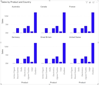
What Are Small Multiples?
Small Multiples split a core visual into multiple miniature charts arranged in a clean grid layout.
Each miniature chart represents a distinct category value, such as a region, product line, or customer segment.
Because all sub-charts share identical X and Y axis scales, users can compare performance differences across categories without visual clutter.
Key Advantages of Using Small Multiples
-
Clean Visual Layout: Prevents messy overlapping line charts or overcrowded stacked column charts.
-
Shared Scale Alignment: Keeps Y-axis ranges identical across all grid tiles so variance is accurately represented.
-
Synchronized Interactivity: Selecting a data point in one sub-chart cross-filters connected dashboard visuals across the entire report.
-
Broad Visual Support: Works seamlessly with line charts, bar charts, column charts, and area visuals.
How to Set Up Small Multiples in Power BI
-
Select a supported chart visual (e.g., Line Chart or Column Chart) on your report canvas.
-
Add your time or category metric (e.g.,
Month) to the X-axis well. -
Drag your primary calculation measure (e.g.,
Total Revenue) into the Y-axis well. -
Drag the category field you want to split by (e.g.,
RegionorProduct Line) into the Small multiples field well. -
Customize grid rows, columns, and border formatting under the Format visual pane.
Upskilling for High-Demand Analytics Roles
Building clean, executive-ready dashboards with advanced features like Small Multiples sets expert developers apart in technical interviews.
If you are looking to gain real-world analytics experience with direct guidance, enrolling in the best power bi training hyderabad provides practical, hands-on exposure to advanced report design and data modeling.
Final Thoughts
Using Power BI Small Multiples turns overcrowded charts into clean, organized grid layouts. By standardizing axis scales and separating categories visually, you make complex comparative analysis simple for business decision-makers.