
How to Build Your First Power BI Dashboard in Under 2 Hours
Data is the lifeblood of modern business. However, raw data in a spreadsheet is rarely useful on its own. If you want to turn numbers into actionable insights quickly, Microsoft Power BI is the ultimate tool.
The best part? You do not need to be a data scientist or a coder to use it. In this step-by-step guide, you will learn how to build your first Power BI dashboard from scratch in less than two hours.
Why Use Power BI?
Before we dive in, let’s look at why professionals love Power BI:
-
Easy Integration: It connects seamlessly with Excel, SQL servers, and cloud data.
-
Interactive Visuals: You can click on any chart element to filter the entire dashboard automatically.
-
Automation: Set your data to refresh automatically so your reports are always up to date.
What a Complete Power BI Dashboard Looks Like
Before starting, it helps to understand your destination. A great dashboard combines key metrics (like total revenue), trend lines over time, and interactive filters.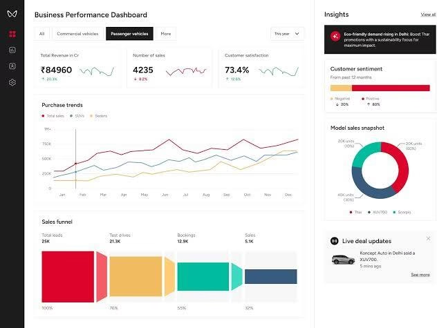
Notice how the layout above uses simple “cards” at the top for big numbers, followed by a trend line and a donut chart for product breakdown. We will create a similar intuitive layout in our steps below.
The 5-Step Process to Build Your Dashboard
Building a dashboard follows a strict, logical sequence. Skipping a step or mixing up the order will cause errors in your data calculations later. Follow these steps precisely to guarantee success.
3 Design Golden Rules for Beginners
When you build your first Power BI dashboard, it is tempting to use every color and chart type available. Don’t do it. Keep your layout clean and professional by following these rules:
-
The “Z” Layout Pattern: Humans read from left to right, top to bottom. Place your most critical summary numbers (like total profit or total users) across the very top row.
-
Limit Your Colors: Stick to a maximum of 3 primary colors. Use muted tones (like grays or dark blues) for backgrounds and save bright colors (like orange or teal) to highlight important data points.
-
Say No to 3D Charts: 3D pie charts and bar graphs distort data shapes and make them incredibly hard to read at a glance. Stick to flat, clean, 2D charts.
Pro Tip: Always leave a little bit of empty space (whitespace) between your visual boxes. This reduces visual clutter and prevents your users from feeling overwhelmed by the data.
Final Thoughts
Congratulations! You just learned how to transform raw data into an interactive visual story. Once you get comfortable with this basic workflow, you can start exploring advanced data analytics features, scheduled email reports, and mobile-responsive layouts.
The best way to master Power BI is through practice. Grab a sample dataset today and start experimenting.