
Executives need quick visual indicators to determine whether key operational performance metrics are meeting planned business goals.
The Power BI Gauge Visual provides a simple radial arc that displays current performance relative to a specific target value or goal.
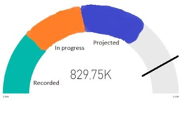
What Is a Radial Gauge Visual?
A Radial Gauge visual features a circular arc that fills up as performance increases.
It highlights your current actual value inside the arc, marks the target goal with a clear line indicator, and displays minimum and maximum boundaries at the outer edges.
Because it focuses on a single key metric, it helps managers evaluate goal completion instantly without analyzing dense data tables.
Key Components of a Power BI Gauge
-
Value: The current numeric measure or actual value being tracked (e.g.,
YTD Revenue). -
Target Value: The specific goal or benchmark line on the arc (e.g.,
Sales Goal). -
Minimum Value: The starting point of the arc scale, defaulted to
0or defined by a measure. -
Maximum Value: The upper limit of the scale, defaulted to double the actual value or tied to a target capacity.
When to Use a Radial Gauge
| Business Use Case | Recommended Visual | Why |
| Tracking Sales Against Quota | Gauge Visual | Displays current revenue clearly against a fixed target line. |
| Project Completion Percentage | Gauge Visual | Shows progress toward 100% completion in a single view. |
| Comparing Trends Over Time | Line Chart | Gauges display a single point in time, not historical trends. |
| Multi-Category Comparisons | Bar Chart | Gauges handle only one metric and target pair per visual. |
How to Set Up a Gauge Visual in Power BI
-
Click the Gauge icon in the Visualizations pane on your report canvas.
-
Drag your actual metric (e.g.,
Total Sales) into the Value data field. -
Drag your target metric or goal (e.g.,
Target Sales) into the Target value field. -
Open the Format visual pane to manually adjust scale minimums, maximums, or target callout colors.
Accelerating Your Data Analytics Skills
Building clean executive dashboards and mastering core visualization properties helps developers stand out in technical interviews.
If you are looking for structured training to build real-world reports under industry guidance, enrolling in a top power bi institute hyderabad provides practical project experience and placement support.
Final Thoughts
Using a Power BI Gauge Visual gives stakeholders an immediate status check on business goals. By highlighting progress against fixed targets, you make executive dashboards easy to read and understand at a glance.